Hello! June is usually one of my favorite months, as it's typically associated with pleasant summertime activities like gardening, going to the beach and bike riding.
Alas, June hasn't been quite as pleasant this year as I'd like. Oh, nothing earth-shakingly terrible has happened, but it's been mostly cooler and cloudier than normal in my neck of the woods. A check of our thermometer a few minutes ago showed that it's about 64 degrees - almost 20 degrees cooler than it should be!
Not so nice for going to the beach, and the below-normal temps and lack of sun have meant slow growing conditions for warm weather crops like tomatoes and peppers.
And I sprained my ankle three weeks ago, which meant no bike riding - and not much of anything else in the way of physical activity the first several days of my recovery either. Again, there are physical injuries and ailments far worse than a sprained ankle, but it was still no fun being sidelined.
But here's to July, which starts tomorrow. It's supposed to feel a bit more summer-like here by the end of the week, and of course there's the 4th of July on Saturday. It's an extra-special day for my family, as my dad will be celebrating his 93rd birthday then.
The festivities continue the next week with our daughter's 20th birthday. Gee, how did she get to be that old?!
To help celebrate the month of July even more, may I suggest the Hallmark website, which can be found HERE.
Yes, good ol' Hallmark, the greeting card (and more) company. As a greeting card maker, I have no need for theirs, but the lifestyle component of their website has lots of fun ideas. When you're on their main page, click on the "Ideas" tab. Once you do that, you'll be directed to the "Ideas and Inspirations" page that currently highlights 4th of July recipes, crafts and free printables - and something called the "30-day chill out challenge".
Hey, chilling out for 30 days sounds fine to me, so I checked it out. Day 2 is a winner: "Treat yourself to some ice cream!" I can go for that. Not much of a challenge there!
However, Day 13 will indeed be more of a challenge: "Try to go the whole day without hearing or reading any news - not even the headlines." Now, I'm not a news junkie by any means, but we do subscribe to the local paper, and I follow certain websites for statewide and national news as well. But I can try to do without any of them for one day.
For more summer fun, scroll down the "Ideas and Inspirations" page, click on "seasons" and then click on "summer". There, you'll see headings for party foods, crafts and more.
I'd seen a display of adult coloring books (a recent craze) at a Barnes and Noble a few days ago and had been tempted to buy one, but I passed. But the folks at Hallmark.com have obliged by supplying downloads for six adult coloring pages - and yes, I printed them out. (They have six pages of kids' coloring pages there as well.)
So, there's lots of ideas on the Hallmark website for making July an even better month! Now, if the weather will only cooperate...
Note: now that I think of it, July has 31 days, and the chill out challenge has only 30 days. Maybe this activity had originally been posted for June? If I'd followed it, maybe June would have been a better month for me. Oh well, better late than never for a chill out challenge!
Tuesday, June 30, 2015
Wednesday, June 24, 2015
Get Carded: For A Dad On The Move
Hello! Father's Day has come and gone, but rest assured it was celebrated around here in grand style: my husband's favorite dinner and gifts from our daughter and me.
Of course, I made a greeting card to go along with my gift:
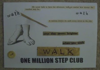 The "walking" theme pays homage to my husband's participation in the wellness program at his place of employment. Pedometers were handed out when this program began for those who wanted them, and my husband has been very faithful in getting at least 10,000 steps day in and day out.
His commitment to this component of the wellness program has been going strong for several years now, so I thought a walking theme was fitting!
Materials used:
Corny, I know, but my husband seemed to enjoy his card anyway.
Of course, I made a greeting card to go along with my gift:

His commitment to this component of the wellness program has been going strong for several years now, so I thought a walking theme was fitting!
Materials used:
- white card stock
- Sayings cut from vintage sources: "He never fails to have his afternoon walk, no matter how stormy the weather may be", "A curious desire--to walk every street in the city" and "your day seems brighter when you walk". The first two sayings were courtesy of 1930s-era grammar books(the first saying shows the corrected grammar that a long-ago student had penciled in), while the last phrase came from the 1947 Sears Spring/Summer catalog.
- photocopied facsimile of a vintage drawing of feet
- "walk" stamped twice in black ink, using two sets of alphabet stamps
- "WALK" written on a scrap of gold art paper.
- a sliver of the same gold art paper was glued onto the card near the upper left corner
- "ONE MILLION STEP CLUB" was cut from an old t-shirt my husband was awarded when he first reached that milestone in the wellness program. (He's done this feat - no pun intended - several times by now.) I reduced the size of the phrase by half when I printed it out onto card stock.
- a vintage beige button was affixed near the lower left corner of the card. My husband asked why the button and I answered him honestly: one of the alphabet stamps had gone astray and left a small black splotch on that part of the card, so I glued the button on top to hide the errant ink. I've found that just about any design error in card-making can be corrected by covering it up in some fashion!
Corny, I know, but my husband seemed to enjoy his card anyway.
Friday, June 19, 2015
Thrifty Acres: Stepping Out In Style With The 1947 Sears Spring/Summer Catalog
Hello! Due to having suffered a sprained ankle recently (household cleaning mishap), foot comfort has been on my mind. Although I can put weight on my injured foot, it remains too swollen for any of my shoes to be worn on it. Consequently, I had to wear one of my husband's shoes while out and about earlier today. Yeah, it looked weird, but I am grateful my ankle is getting better.
Anyway, while looking at my 1947 Sears Spring/Summer catalog (a cheapo secondhand find), I noticed a number of nifty line drawings accompanying the footwear offerings, so I'll show off some examples of both in this post.
 Only a few footwear pages show shoes in colors other than black, brown or white, and thus only a few of the line drawings are also in color; the above is one example. A stylishly-dressed woman is shown using what looks to be some sort of telescopic device. Perhaps this was meant to indicate she was a tourist.
On the same page:
 "Exotic sandal...born to lead summer costumes a brighter life...Hand made by native artisans in far off Haiti." Priced at $5.45, which would equal $58.12 this year.
 Above, our duo is following the action at a racetrack. The gal on the right looks a little like Taylor Swift, I thought. Indeed, Ms. Swift's casual clothing and swimsuits often look like they came from the 40's.
Not sure what Ms. Swift would think of the shoes though:
 "Sharp 'flats' give you the springy easy walk that only flats permit!" That $3.98 sets one back $42.44 in today's money.
 Of course, dancing was a very popular activity in this era, so we see this dapper couple doing just that. And what might the woman have been wearing on her feet?
 "Rise to heavenly heights of fashion on a sky-high platform...Lovely spring party companion." The heel height is 2 1/2", which doesn't seem so "sky-high" compared to today's stilletto heels. And today's price tag would be $63.77 compared to 1947's $5.98.
I've covered a few shoes for the gals, now it's time to see what the guys were wearing back then:
 So what would this man relaxing at an outdoor cafe have on his feet? How about:
 Not bad! "Moc-Style...harness-stitched by hand around the vamp" - $9.75 then, $103.97 now. The shoe on the right is priced 30 cents lower, but is described much more fancifully: "the 'in-betweener' combines the cushioned, free-and-easy comfort of platform casuals with the coolness and custom appearance of hand-woven dress shoes." All that for $9.45, or $100.77 in 2015 money.
I liked this drawing of the gent treating his gal to a night out at the movies:
 "Wear them to the movies, the ball game, ...everywhere on your day off." The "them" means the footwear shown on the catalog page, of course, but the three examples shown all look similar:
 "Get out of stiff, hot, winter-weight shoes...get into these breeze-conditioned he-man sandals and let your feet take a rest." Only $3.29, or $35.08 today.
To me, these shoes look awfully casual to be worn with the three-piece suit-and-tie outfit the man in the drawing is wearing, but what do I know? The sandal just above the one featured in my photo is modeled by a man in nice slacks and socks.
A nicer look for relaxation, in my opinion:
 While chilling out on a lawn swing, our guy could be wearing:
 "Elastic side gore on or off in a wink. Comfortable cool cotton fabric." These look nice, and have a nice price of $2.98; $31.78 today.
I'm showing only a fraction of the footwear offered in my Sears catalog - for guys, gals and kids, there are dozens of styles. But unfortunately, one product was nulled:
 Seems like a shame that the Army combat boots weren't available after all. Had they been surplus after WWII and were sold out by this point? Or did Uncle Sam decide to keep the boots for itself in case another war began? I don't know.
What I do know, however, is that I found it awfully fun to look over the pages of this vintage Sears catalog, and it helped me forget my temporary foot woes for awhile!
Note: price calculations were done with the online resource US Inflation Calculator. You can find this handy tool HERE.
Anyway, while looking at my 1947 Sears Spring/Summer catalog (a cheapo secondhand find), I noticed a number of nifty line drawings accompanying the footwear offerings, so I'll show off some examples of both in this post.

On the same page:


Not sure what Ms. Swift would think of the shoes though:


I've covered a few shoes for the gals, now it's time to see what the guys were wearing back then:


I liked this drawing of the gent treating his gal to a night out at the movies:


To me, these shoes look awfully casual to be worn with the three-piece suit-and-tie outfit the man in the drawing is wearing, but what do I know? The sandal just above the one featured in my photo is modeled by a man in nice slacks and socks.
A nicer look for relaxation, in my opinion:


I'm showing only a fraction of the footwear offered in my Sears catalog - for guys, gals and kids, there are dozens of styles. But unfortunately, one product was nulled:

What I do know, however, is that I found it awfully fun to look over the pages of this vintage Sears catalog, and it helped me forget my temporary foot woes for awhile!
Note: price calculations were done with the online resource US Inflation Calculator. You can find this handy tool HERE.
Wednesday, June 10, 2015
iHanna's Spring 2015 Postcard Swap: I've Got More Mail!
I'd recently posted about a batch of art postcards I received through iHanna's swap, as seen in this post.
Since then three more postcards from the swap have been delivered to me, so I thought it was only fair to show them off as well.
 I'm sure there are some people who disdain Hershey's chocolate in favor of some artisanal or imported chocolate, but I still think it's just fine. And obviously the postcard artist from Florida who created the above piece agrees as well! "Can you guess what candy I love?" she wrote on the back. She said she crafted her postcard by sewing the wrappers to a piece of heavy interfacing, then sewed the interfacing to a piece of cardboard. I've not done much paper sewing, so I liked her efforts very much.
 "I took a walk and gathered bits of nature for you" this postcard artist commented on the back. Now, the butterfly is actually a sticker, but the leaf, pine needle and squiggly green stuff between the leaf and the butterfly are the "bits of nature".
As the artist lives in a community along California's Monterey Bay, I wondered if that green stuff was actually seaweed from the waters of the bay, but didn't ask.
Last one to show off:
 Also from California (near Oakland) is this very fun postcard. It's literally see-through since the artist laminated her elements together. The combination of scrapbook paper, origami paper and three kinds of cancelled stamps (two from foreign lands) made for a very appealing work of mail art!
I thought it was cool that the scrap of purple and white origami paper in the lower right-hand corner was identical to some origami paper I'd once had. What are the odds of that?
The artist commented that she wasn't sure if this type of postcard would go through the mail, so she sent one to her granddaughter first to see if it'd get delivered. It did and so she continued on with this style.
The arrival of these three postcards means that I've now received 9 out of the possible 10. I'm hoping that the last one is still on its way - a little slow due to international mail and not because someone had procrastinated. I'd sent out 2 postcards to other countries (Norway and South Africa) so it would seem logical that I'd get at least one postcard in return from another country. Time will tell, I suppose.
It'll be a delightful surprise when #10 shows up in my mailbox, just as it was fun to receive the other nine. I would be willing to do the next iHanna postcard swap, whenever it might be! After all, who doesn't like a delightful surprise in the mail?
Since then three more postcards from the swap have been delivered to me, so I thought it was only fair to show them off as well.


As the artist lives in a community along California's Monterey Bay, I wondered if that green stuff was actually seaweed from the waters of the bay, but didn't ask.
Last one to show off:

I thought it was cool that the scrap of purple and white origami paper in the lower right-hand corner was identical to some origami paper I'd once had. What are the odds of that?
The artist commented that she wasn't sure if this type of postcard would go through the mail, so she sent one to her granddaughter first to see if it'd get delivered. It did and so she continued on with this style.
The arrival of these three postcards means that I've now received 9 out of the possible 10. I'm hoping that the last one is still on its way - a little slow due to international mail and not because someone had procrastinated. I'd sent out 2 postcards to other countries (Norway and South Africa) so it would seem logical that I'd get at least one postcard in return from another country. Time will tell, I suppose.
It'll be a delightful surprise when #10 shows up in my mailbox, just as it was fun to receive the other nine. I would be willing to do the next iHanna postcard swap, whenever it might be! After all, who doesn't like a delightful surprise in the mail?
Sunday, June 7, 2015
Get Carded: For Dad And Grad
So into my studio I went to create their greeting cards and here's what I came up with, starting with the graduation card:

- white card stock
- stamped background in blue ink
- card stock scrap in yellow with blue and white stripes
- blue and white origami paper scrap
- graduation cap made from yellow card stock
- diploma stamped on vintage time card piece in blue ink
- stars stamped in blue ink
- "Congratulations" stamped in blue ink
I think this turned out pretty well.
For my dad:

- white card stock
- green art paper scrap
- scrap from vintage hymnal
- scrap of vintage menu I'd altered
- green/white striped paper from vintage magazine
- flower stamped in green on scrap from vintage recipe booklet
- "Here's to you Dad!" stamped on card stock scrap in black ink; portion of design colored in with green marker
Of course, Father's Day isn't for a couple of weeks yet, but my dad doesn't live too far from where the niece lives. However, neither live all that close to us, so it made sense to combine a visit to both in one weekend.
Besides, we'll be back to visit my dad on the 4th of July for his 93rd birthday. And that means I'll have another card-making occasion coming up soon!
Wednesday, June 3, 2015
Thrifty Acres: Back to 1976
Hello! It's been awhile since I showed off a vintage magazine, so without further ado, let's go back to January 1976, courtesy of a Woman's Day magazine I found at a thrift store.
I was in high school that year, and my mom had already been subscribing to Woman's Day for several years, so finding this issue was a trip down Memory Lane for me.
1976 was a big year for the US, as that was when the Bicentennial was celebrated. Consequently, this was in my magazine:

This scene of two young children viewing a colonial-era museum display illustrated the front cover of that year's Woman's Day calendar. I remember these calendars, which were included in the January issues. They were printed on several pages within the magazines, with instructions for assembling them included. My mom never put the calendars together, which I thought was a shame back then, but obviously whoever had this magazine in 1976 hadn't assembled it either.
Continuing on with the Bicentennial theme:
 Another monthly inclusion that was designed to be torn away from the pages of Woman's Day: the Collector's Cookbook. In keeping with the Bicentennial theme, it's the "New All-America Cookbook"for my issue. I glanced through the booklet and you know what, the recipes mostly looked pretty good. Too bad my mom never tried them; I don't recall her using these recipe booklets.
But again, neither did the person who originally owned the magazine!
Another never-used inclusion, this time from an advertiser:
 I found it bizarre that the above trial-size packet of three Star brand coffee filters was never opened. I showed it to my husband and said we should try these for ourselves. He wasn't inclined to do so, so I left the packet as is. Still, I had to wonder what their condition would be like nearly 40 years later. Would the filters have fallen apart by now? Maybe smell funny or look discolored?
One thing's for sure - the Star brand must have fallen apart, since I've never even heard of it.
As I'd said, in 1976 the US celebrated its 150th birthday, but 1976 seems to be around the time another "birth" occurred:
 Bounce dryer sheets are now as common as can be, but they were "remarkable" and "new" in January 1976. Now, this is one product I do remember my mom adopting when it came out. With a family of 10, 3-4 loads of laundry nearly every day of the week was the norm, so it's understandable that she gladly used a product that made the task a little easier.
Of course, Woman's Day was more than calendars, recipe booklets and ads. Home decor articles were prevalent as well, though in retrospect that may not have always been such a good thing:
 And what do we have here? Why, it's this: "Blend in your windows by painting both molding and venetian blind in the pattern of your wallpaper. The white blind needed only yellow paint and narrow black tape for the vertical stripes."
This is the first time I can recall seeing a Venetian blind and molding being painted to match wallpaper - and I hope it's the last! In my opinion, it seems like it would be a real pain to paint those squares - and applying that "narrow black tape" on a blind - no thanks!
Fortunately, beds seemed to fare better, such as this craft:
 This quilt is a updated version of the Log Cabin pattern. This would still look nice today, I think.
 Another ad, this time for Cannon's Picnic pattern with its design of pastels in plaids and flowers. One could complete the above look with "deliciously thick" towels, "pillow cases of no-iron cotton and polyester", "quilted bedspread of cotton and polyester" and "muslin sheets".
Wait a minute, muslin sheets? They were still using muslin for sheets in 1976? I mean, in Laura Ingalls Wilder's These Happy Golden Years, bride-to-be Laura sews muslin sheets for her trousseau - but that book took place nearly 100 years before my Woman's Day magazine was published. I never realized that muslin sheets were still around in 1976. I am much more familiar with good old percale.
Then again, I seem to recall my mom having sheets that looked a lot like Cannon Picnic, so maybe I slept on muslin back then and didn't even know it.
Oh well, it certainly didn't hurt me - and it certainly didn't hurt me to read the January 1976 issue of Woman's Day magazine - in fact, I greatly enjoyed this blast from the past!
I was in high school that year, and my mom had already been subscribing to Woman's Day for several years, so finding this issue was a trip down Memory Lane for me.
1976 was a big year for the US, as that was when the Bicentennial was celebrated. Consequently, this was in my magazine:

This scene of two young children viewing a colonial-era museum display illustrated the front cover of that year's Woman's Day calendar. I remember these calendars, which were included in the January issues. They were printed on several pages within the magazines, with instructions for assembling them included. My mom never put the calendars together, which I thought was a shame back then, but obviously whoever had this magazine in 1976 hadn't assembled it either.
Continuing on with the Bicentennial theme:

But again, neither did the person who originally owned the magazine!
Another never-used inclusion, this time from an advertiser:

One thing's for sure - the Star brand must have fallen apart, since I've never even heard of it.
As I'd said, in 1976 the US celebrated its 150th birthday, but 1976 seems to be around the time another "birth" occurred:

Of course, Woman's Day was more than calendars, recipe booklets and ads. Home decor articles were prevalent as well, though in retrospect that may not have always been such a good thing:

This is the first time I can recall seeing a Venetian blind and molding being painted to match wallpaper - and I hope it's the last! In my opinion, it seems like it would be a real pain to paint those squares - and applying that "narrow black tape" on a blind - no thanks!
Fortunately, beds seemed to fare better, such as this craft:


Wait a minute, muslin sheets? They were still using muslin for sheets in 1976? I mean, in Laura Ingalls Wilder's These Happy Golden Years, bride-to-be Laura sews muslin sheets for her trousseau - but that book took place nearly 100 years before my Woman's Day magazine was published. I never realized that muslin sheets were still around in 1976. I am much more familiar with good old percale.
Then again, I seem to recall my mom having sheets that looked a lot like Cannon Picnic, so maybe I slept on muslin back then and didn't even know it.
Oh well, it certainly didn't hurt me - and it certainly didn't hurt me to read the January 1976 issue of Woman's Day magazine - in fact, I greatly enjoyed this blast from the past!
Subscribe to:
Posts (Atom)