Hello! Spied this project awhile back The Spirit Of Christmas 20th Anniversary Edition (thrift store find):
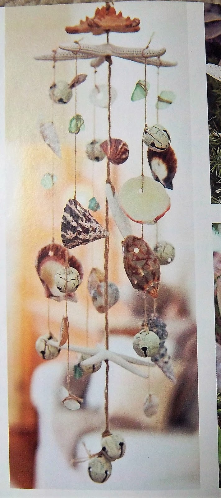
In the chapter entitled "Beach House Christmas", a seashell-laden wind chime is shown. But the thought of seashell crafts in the dead of winter didn't make sense to me. I thought this item would look better in the summer, when the local beaches where I live can actually be used.
I had plenty of seashells on hand (another thrift store find), but didn't have the starfish and sea glass that are on the supply list. So instead I went to one of the local beaches to pick up some driftwood, and used beads for the sparkle the sea glass would have given. I also omitted the jingle bells, so I'm calling my finished project a mobile rather than a wind chime.
Here's how it turned out:
This mobile didn't photograph very well, no matter where I hung it, so I'm showing off two pics: hanging up on an interior door and laying on the carpeting. It's actually hanging up on the front porch, but it's even harder to get a good shot there.
Some close-ups:
Overall, this was an easy project, although there were a few tricky parts along the way. For one thing, I learned that some seashells don't take well to having holes drilled in them. Fortunately, some of my thrift store seashells had holes in them already, and I was able to make holes in some of the remaining shells without too much effort.
The other problem was finding the right-size needle: one that was thin enough to go through my chosen beads, but also with a thick enough eye to accommodate the thin twine I was using for the strings.
But once the shell-drilling and the needle-threading were accomplished, the project went together fairly quickly. I started by drilling five holes in my driftwood piece: one on each end, one in the center, and one between the center hole and each end hole.
Next, I strung thick twine through the two end holes, tying the top center of the twine into a hanging loop. Each end was knotted underneath the driftwood.
Then all that remained was the arrangement of the three strands. Using thin twine, the end of each strand was threaded through the top of the driftwood. I added two beads to each end and then knotted the twine.
Each strand was then strung with alternating beads and shells. I didn't measure where to place these; I just tied them on. The middle strand is the longest, so it has one extra bead and shell.
For extra measure, I dabbed each knot with a bit of waterproof glue. Hopefully this will keep the knots from unraveling.
As far as dimensions, my driftwood piece is 15" long (horizontal length). The mobile measures about 40" long. I didn't plan a particular length, it's just what I ended up with. This is the kind of project that's pretty adaptable; you can make it as big or as small as you'd like.
And if you want, you can always use your mobile to decorate for a "Beach House Christmas", as the Spirit Of Christmas folks had intended. I'm fine with my beach-look mobile in the summertime!
Hello! Family and friends gathered this past weekend to attend the high school open house for one of my nephews. A good time was had by all, and I also had a good time crafting his greeting card:
Materials used:
- white card stock
- gold art paper scrap
- blue art paper scrap (has a bit of gold on it too)
- graduate silhouette image cut from vintage wrapping paper
- diploma shape stamped on white card stock scrap, ribbon colored in with blue marker; cut out and affixed to card
- stars cut from blue serendipity paper and gold art paper scraps
- "Congrats" stamped in blue ink
It's a rather simple card design, but I figured a young man wouldn't care for a fancier design. His high school has blue and yellow for its colors, so the blue and gold of this card was a close match.
But as for college school colors, this nephew is going to our alma mater, Michigan State University. So I used green and white ribbons to wrap a gift I'd made him (a fleece blanket made from a MSU-licensed pattern).
My nephew did very well in high school, so I have no doubt he'll do equally well at MSU. Good luck, and Go Green! Go White!
Hello! In my previous post, I showed off vintage ads of products which have disappeared from store shelves. In today's post, I'll show off ads from products that are still around, but with different packaging - and different ad campaigns, of course. These ads are also from the September 1948 issue of Woman's Day magazine.
Above, the mom looks absolutely ecstatic - and so does her son - over the pouring of V-8 juice into his drinking glass. They may be thrilled, but when I was a kid, I was thrilled my mom never served the stuff! Don't care for it, but I'm sure it's still considered a "wholesome easy-to-serve drink".
In fact, the "easy-to-serve" aspect was highlighted in a current V-8 ad campaign, in which the V-8 imbibers were competing against opponents who favor trendier healthy beverages. In one commercial, a man downs his V-8 while a muscle-bound fellow is still shaking his drink to mix it. In the other commercial, a woman empties her glass of V-8 while her competitor is calling in an order to some juice bar or smoothie place.
I thought both commercials were hilarious, even if I still don't like V-8!
The "Derby" name is no more, but Peter Pan peanut butter is still around. (at the time of this ad, Derby Foods was a subsidiary of Swift & Company. This peanut butter is now made by ConAgra Foods.) The ad also mentions "New...Crunchy...Tasty, crunchy peanut bits mixed all through the smooth goodness of Peter Pan Peanut Butter."
"mixed all through" - guess they pointed that out so folks wouldn't think the "peanut bits" were only on top!
I think the vegetables on the label resting in front of the tomatoes are supposed to be peppers, but what's the green stuff behind the tomatoes supposed to be? The ad mentions that Hunt's Tomato Sauce is made with "fine spices and seasonings", so perhaps it's something along those lines.
The ad copy ends with this: "Get six cans right away!" But why that particular number? The ad doesn't say.
This time of year, grocery store end-caps are loaded with s'more fixings: graham crackers, marshmallows and chocolate bars. But in this ad, the product is used in a pie crust for Peach Meringue Pie. "Make this 'new' company pie!" the ad copy exclaims. I have to admit, I'd never heard of peach meringue pie, but a google search came up with several recipes for it.
The Nabisco graham cracker boxes certainly don't look like this anymore. I think the the graphics on this box appear quite old-fashioned.
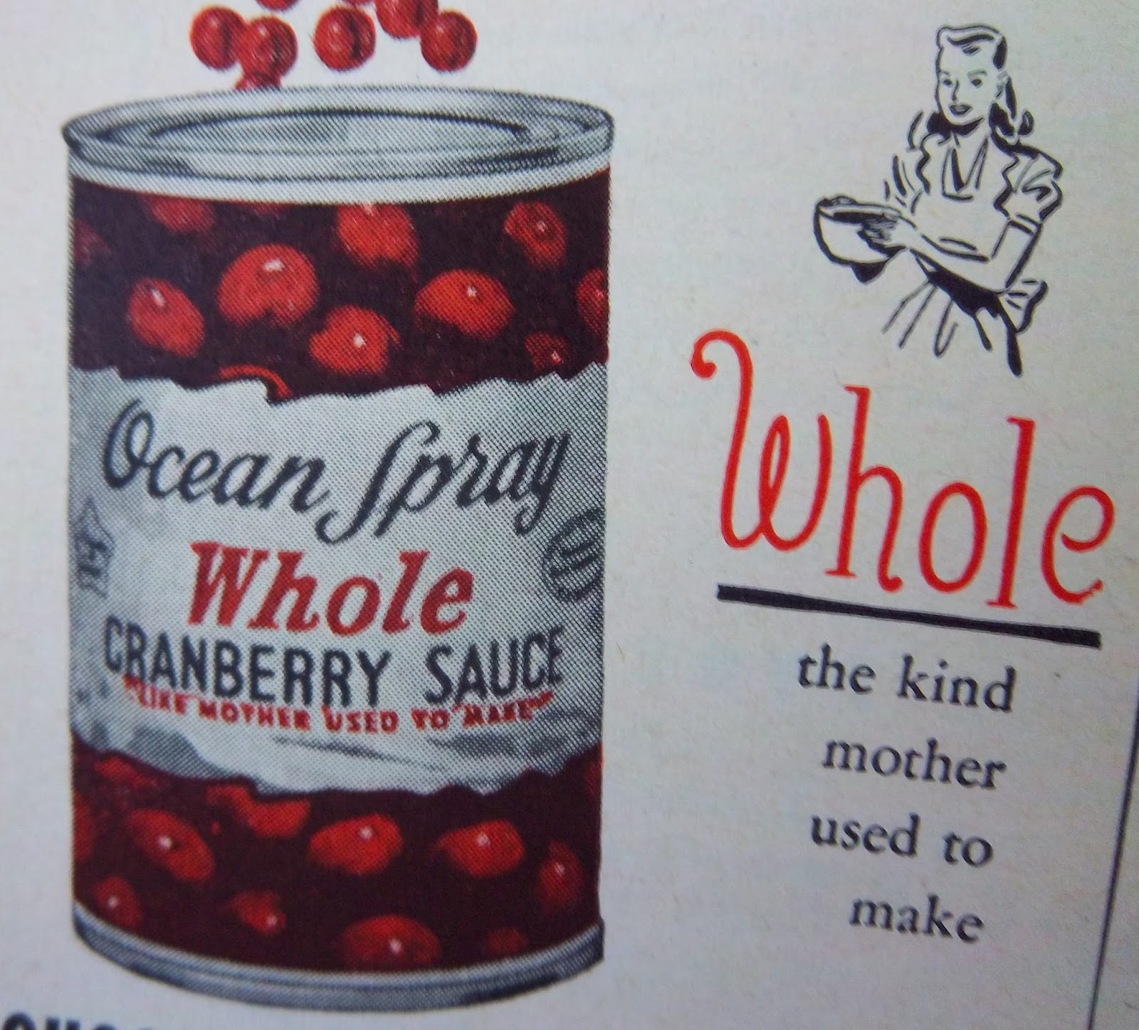
Also old-fashioned in appearance are the graphics for these Ocean Spray cranberry products:
Yeah, I know the ad is from a magazine that's almost 70 years old, but by comparison, the graphics on the Hunt's can seem more modern in style.
Rit's still around, but I don't know if "Lots of girls" are still "dunking dresses" in it. I've used Rit a handful of times myself, most notably to change the color of some compression socks my dad was supposed to wear. I couldn't find this type of sock in green, his favorite color, so I dyed several pairs in green Rit dye. Worked pretty well.
Good ol' French's mustard, which was first introduced at the 1904 World's Fair in St. Louis. From that auspicious beginning, the R. T. French company (the founder's name was Robert Timothy French), has endured. I read that it's currently the #1 mustard brand in the US.
Well, that's it for my blast from the past. I wonder how many of these products will still be around 69 years from now? And if still around, who knows what their packaging - or their ads - will look like!
I gladly buy up vintage magazines when I come across them inexpensively, which is usually the case at thrift stores. My latest such acquisition was this:
The September 1948 edition of Woman's Day magazine, which set me back just 20c more than its original price. Such a deal, eh?
I loved the sweet photo of that cat on the cover, and I also loved the content inside: a typical blend of fashion, interior decorating, various perceived threats to the American Way Of Life (comic books, apparently, were considered a source of trouble), recipes and several short stories.
But what I loved most of all were the ads. Many of them were for products still produced today, but there were a number of promos for consumer goods I'd never heard of. I thought it'd be interesting to see, via the Internet, what had happened to these unfamiliar brands.
As it turned out, in some cases I got my answer, but other searches only seemed to come up with images of the same (or similar)vintage ads I'd seen in my magazine. But here goes with what I learned:
Purity cheese products, from Mayville, WI. The company was founded in 1936, but alas, no more "festive summer sandwiches" can be made with this brand, as it was gone by 1975.
Another cheese brand:
Yes, the "Pabst" in Pabst-ett gets its name from the Pabst beer folks. Needing a way to make money during the Prohibition era, they turned to cheesemaking. After Prohibition was repealed, Pabst sold its cheese operation to Kraft. I couldn't find a definitive link between Kraft and the Phenix brand, and also didn't learn when this brand disappeared.
Morgan-Jones dish cloths. I read that this company began in North Carolina in 1872 and was bought out by Spring Industries in 1963. On eBay, the label seems to be most associated with chenille bedspreads, but the company made other types of bed linens - and obviously kitchen linens as well.
Now, Foot Rest shoes may very well have been "A JOY TO WORK IN...PLAY IN...LIVE IN", but the only live-in being done now is the old shoe factory in Cincinnati that morphed into an apartment building. However, I didn't discover when the parent company, Krippendorf-Dittmann, had closed down.
In 1948 there may very well have been "No Substitute for Chiffon" soap flakes, but folks today will just have get along with a substitute. This is another brand that appears to have disappeared, and I didn't learn when or why.
Another cleaning product:
Glass Wax. Despite that name, the full page ad in which the above image appeared also trumpeted Glass Wax as a cleaner of appliances, metal furniture, copper utensils, tile, porcelain and more. I guess that "wartime chemical discovery" (WWII, I assume) that made Glass Wax possible was a very good thing - but unfortunately, the ad makes no mention of what exactly that discovery was.
My Internet search didn't come up with the info about that "discovery" either, but I did learn about yet another use for this already-versatile product: the decorating of windows with holiday-theme stencils and good ol' Glass Wax. You can read about this past time here.
The link is for a blog post, which besides talking about the window stenciling, also mentions that this product is no more. I guess the "wartime chemical discovery" and the claims about how many surfaces Glass Wax could clean only went so far. I didn't find out why its parent company, Gold Seal, is no longer around.
Ah, so many disappearing products represented by the ads in this great old Woman's Day magazine (there were several more I could have shown off). But like I'd said, there were also a lot of ads for products that are still around - albeit in different packaging. So for my next post, I'll show off some of those ads!
Hello! I enjoy making greeting cards, so was happy to do so for three recent occasions.
In order of their appearance, first the late card. We were out of town on Father's Day, so we celebrated it instead on the following Sunday. Here's the card I made for my husband:
Materials used:
- white card stock
- vintage car ad from 1962 Reader's Digest
- Man image cut from 1978 Sears catalogue
- "for a dad on the go" words cut from various vintage magazines and dictionaries
- pale gold trim glued on top
My husband used to collect old Chrysler/Dodge/Plymouth cars, though the oldest one he ever owned was a '63 (back around 1980). And he used to have a hairstyle in 1978 similar to the young man's on the card.
Perhaps because of these images, he loved his card.
Our daughter moved to Indiana last month to begin grad school at Purdue. We went down there to visit over the long 4th of July weekend. Her birthday would happen a few days after our return home, so we celebrated the occasion while there.
Her birthday card:
Materials used:
- white card stock
- page from a 1940's-era chemistry textbook
- scrap from handout pertaining to a chemistry building at Purdue, artificially aged by me with rubber stamp ink
- woman image cut from early 1960's Reader's Digest ad (in the ad, the woman was looking on with delight at her new TV)
- "22" cut from vintage Bingo card (the age our daughter was turning)
- "Happy Birthday To You" stamped in blue ink onto paint sample scrap
- leather scrap accented with eyelet (from vintage eyelet-setting kit found at rummage sale
Our daughter loved her card as well. She recognized the "aged" scrap as pertaining to one of the chemistry buildings on campus, and I reminded her that the page from the vintage chemistry textbook had also come from Purdue. When we'd helped her move into her apartment last month, we went to her end of campus so she could check in at her department office. While there, I noticed the "free" table out in the hallway near the office, and that's where I grabbed that textbook, along with a few other vintage odds and ends. (I scrounge everywhere I go!)
Now for the on-time card. As I'd mentioned, we went down to visit our daughter over the 4th of July holiday. True, she had a few days off, but had been very busy at work before then, plus had been setting up her apartment during her scant free time (she's had to work on Saturdays).
I know from personal experience that it can be trying to have house guests when you're still in the process of settling in your new living quarters (not that it kept us from asking if we could stay there anyway, as it would save us on hotel costs). Nevertheless, she was a good hostess, and I wanted her to know that we appreciated her efforts.
So I made her a thank you card:
Materials used:
- white card stock
- scrap from vintage cookbook page
- scrap from 1880's ledger paper, altered with stencil and purple acrylic paint
- scrap from vintage cookbook page
- "M" stamped in black ink, then colored in with purple marker (her name begins with that letter)
- "thank you very much" stamped in purple ink
- flower shapes punched out from vintage cookbook page
(used to cover up some stray ink marks made while stamping the saying)
I chose purple because that's her favorite color, and she's fond of animal prints; hence the zebra-stripe stencil design.
We called her last night for her birthday and she said she'd gotten this card. She was pleased, but told me it hadn't been necessary to send it.
I replied that I knew that, but I wanted to let her know that we hadn't taken her hosting efforts for granted.
Besides, I do enjoy making cards!