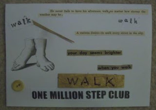
Of course, I made a greeting card to go along with my gift:
The "walking" theme pays homage to my husband's participation in the wellness program at his place of employment. Pedometers were handed out when this program began for those who wanted them, and my husband has been very faithful in getting at least 10,000 steps day in and day out.
His commitment to this component of the wellness program has been going strong for several years now, so I thought a walking theme was fitting!
Materials used:
- white card stock
- Sayings cut from vintage sources: "He never fails to have his afternoon walk, no matter how stormy the weather may be", "A curious desire--to walk every street in the city" and "your day seems brighter when you walk". The first two sayings were courtesy of 1930s-era grammar books(the first saying shows the corrected grammar that a long-ago student had penciled in), while the last phrase came from the 1947 Sears Spring/Summer catalog.
- photocopied facsimile of a vintage drawing of feet
- "walk" stamped twice in black ink, using two sets of alphabet stamps
- "WALK" written on a scrap of gold art paper.
- a sliver of the same gold art paper was glued onto the card near the upper left corner
- "ONE MILLION STEP CLUB" was cut from an old t-shirt my husband was awarded when he first reached that milestone in the wellness program. (He's done this feat - no pun intended - several times by now.) I reduced the size of the phrase by half when I printed it out onto card stock.
- a vintage beige button was affixed near the lower left corner of the card. My husband asked why the button and I answered him honestly: one of the alphabet stamps had gone astray and left a small black splotch on that part of the card, so I glued the button on top to hide the errant ink. I've found that just about any design error in card-making can be corrected by covering it up in some fashion!
Corny, I know, but my husband seemed to enjoy his card anyway.

No comments:
Post a Comment