Hello! I often get compliments on my handcrafted greeting cards, but I wasn't born knowing how to make them - no, it's been a matter of "practice makes perfect". My early efforts were pretty lame compared to the cards that come out of my studio these days.
This was readily apparent when I hauled out our Valentine's Day card collection earlier this week to display as seasonal decor. For comparison's sake, in this post I'll show two cards I'd made for my husband, a decade apart.
First, from 2001:
White card stock has been decorated with a strip of art paper and eight small hearts, each cut from a different kind of decorative paper. That's it - no words, no stamps, and not a scrap of vintage ephemera to be seen!
A close-up:
See what I mean? It's a pretty boring card.
Let's move on to ten years in the future, to 2011:
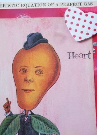
White card stock again, but it's been layered with a part of a page from a vintage science textbook, a piece of serendipity paper, part of a page from a book about Victorian gardening, a heart cut from scrapbook paper and the word "Heart" stamped beneath the heart.
A close-up:
Using a page from a vintage science textbook may seem odd for a Valentine, but its inclusion paid homage to my husband being in the chemical engineering field. (He knows what a "characteristic equation of a perfect gas" is!) The pear image was used to add some whimsy, which he also appreciated. I rubbed a bit of red acrylic paint on the pear image to blend it in better with the serendipity paper behind it.
I've taken very few craft classes in my life, but one of them was a four-week ATC (artist's trading cards) course here at the local arts council. That's where I learned to make serendipity paper. In the class we decorated atlas pages with acrylic paints and rubber-stamped images to make this type of decorative paper. But with the serendipity paper used in the above card, I started with an old poster. Besides paints and stamped images, I also glued on bits of art paper and flowers punched out of an old brochure.
It's obvious that this card took longer to make than the first card, but I feel it was worth it! The crafting process was more fun and the resulting card was more appealing to the recipient as well.
But to be honest, I can't say it was mere practice alone that caused an improvement in my card crafting from 2001 to 2011. For one thing, the "show and tell" aspect of the Internet means that countless examples of creative inspiration are now instantly at one's fingertips. Back in 2001, sites like Etsy, Pinterest and You Tube weren't around, and blogging was still in its infancy.
In 2001, most of my crafting "education" came from TV shows, books and magazines that pertained to my hobby interests. In 2002 I discovered the mixed media magazine Somerset Studio. It was like waking up from a long sleep; I was truly inspired by the artistic sophistication of the works shown in its issues.
Somerset Studio's parent company, Stampington and Company, has since added more arts and crafts magazines; their website says they now have over 30 publications! Artful Blogging, GreenCraft and Somerset Life are some of the ones I've enjoyed reading.
And it was through these magazines, and all that Internet content, that I became interested in using vintage and upcycled materials in my card crafting. In 2002 I moved to a town that has several thrift stores in the area, so I've had plenty of opportunities to expand my creativity - and the supplies to help fuel it.
It's been a great journey for me, and I look forward to more crafting and creative growth in the future! Wonder what my cards will look like ten years from now?


No comments:
Post a Comment